
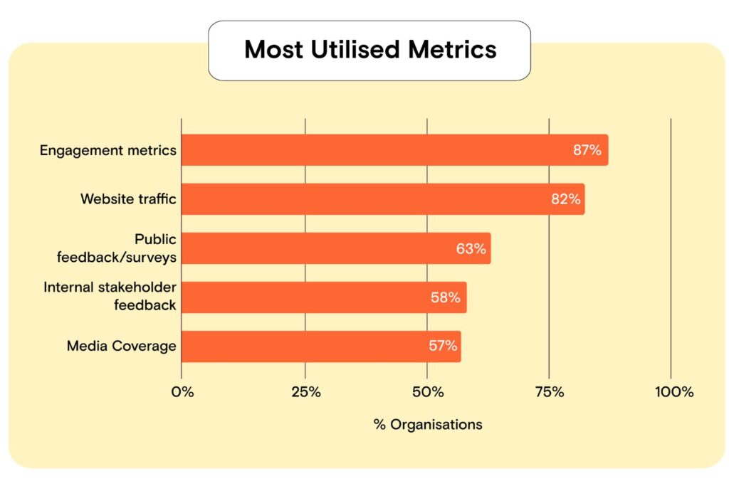
If you work in public sector communications, you almost certainly report on engagement metrics and website traffic. Punchy Studio’s 2026 survey of public sector communications professionals across Australia found that 87 percent of respondents use engagement metrics such as views, likes and shares, and 82 percent track website traffic. Fewer than two-thirds use public feedback or surveys, and only around half draw on internal stakeholder feedback or media coverage.
This article draws on findings from Punchy Studio’s State of Public Sector Communications 2026. You can download the full research findings as a PDF.
The problem isn’t that these teams are lazy or unsophisticated. It’s that the easiest things to measure and the things that actually matter are often not the same thing. A “like” is simple to count. A behaviour change, a reduction in call-centre inquiries, or a shift in public understanding of a policy is not. The result is a sector that reports confidently on activity while remaining genuinely uncertain about impact.
What the research actually shows
Punchy’s survey found an average measurement confidence score of 4.75 out of 7, roughly 68 percent. On the surface, that looks reasonably healthy. But the average hides a wide gap between sectors:
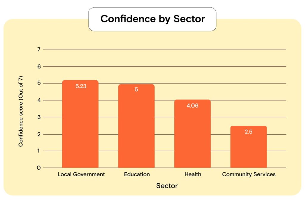
Local government sits comfortably ahead, while Community Services trails by nearly three full points. It suggests two genuinely different working systems.
Local government teams generally have unified digital platforms covering rates, registrations, permits and service requests. Those platforms generate structured data almost as a by-product of doing business. Community services teams, by contrast, often work with anonymous, transient or hard-to-reach populations where there is no equivalent transactional trail to lean on. The confidence gap is more plausibly explained by data infrastructure than by any difference in skill or effort.
Punchy’s data also found a correlation of 0.43 between the number of different metrics a respondent used and how confident they felt in proving impact. This is a moderate correlation, not proof that using more metrics causes more confidence, but it’s consistent with the idea that no single data source tells the whole story. Teams who triangulate across social data, web analytics and survey feedback appear to feel more assured about what they can claim, even where the underlying difficulty of measuring behaviour change hasn’t gone away.
The gap between what’s easy to count and what actually matters
This is where the “vanity metrics” problem, well documented in commercial marketing, becomes useful context for public sector teams, with an important caveat: the evidence base here comes from B2B and commercial marketing, not from government research, so it should be read as a parallel rather than a direct read-across.
Gartner’s 2022 survey of marketing analytics users found that marketing analytics only influence 53 percent of decisions, largely because so much of what gets tracked is high in volume and low in decision-relevant insight. The parallel to Punchy’s findings is fairly direct: it’s easy to build a dashboard full of numbers that go up and to the right, and much harder to build one that tells you whether the thing you actually needed to happen, happened.
Public sector communications carries a version of this same trap, but with a sharper edge. In commercial marketing, the ultimate outcome (a sale) is at least measurable in principle. In government communications, the outcome you’re chasing is often something like increased vaccination uptake, safer driving behaviour, or better understanding of an entitlement. These are harder to observe, slower to shift, and rarely attributable to a single campaign or channel.
The Australian National Audit Office has looked directly at this distinction in its own performance audits. Its insight paper on developing performance measures and tracking progress makes the point that measures exist to show whether an entity delivered what it was tasked with delivering, whether that’s reaching an agreed number of people or achieving a genuine social or economic effect. Counting outputs (how many people saw a post) is a legitimate first step. Mistaking that count for evidence of outcome (whether the message changed anything) is where measurement goes wrong.
This distinction already has formal backing in Commonwealth practice. The Commonwealth Evaluation Policy requires entities covered by the Public Governance, Performance and Accountability Act to measure, assess and report on performance in ways that go beyond activity counts. Communications teams sit inside agencies that are already expected to work this way for program evaluation. There’s no reason communications measurement should be exempt from the same standard, even if it currently often is.

Why this happens, even among capable teams
It’s worth being fair to the 87 percent of respondents leaning on engagement metrics. Three structural pressures push teams toward output measures, regardless of skill or intent.
Speed of reporting. Engagement numbers and web traffic are available instantly, often in a native platform dashboard. Outcome data, such as a shift in survey-measured awareness or a change in service uptake, usually requires a separate research exercise with its own budget and lead time.
Attribution difficulty. If call-centre inquiries drop after a campaign, was that the campaign, a policy change, a seasonal pattern, or something else entirely? Government communicators rarely control enough of the surrounding environment to isolate their own effect with confidence, and unlike a retailer tracking a single checkout page, there is no clean conversion event to point to.
Budget and headcount. Community Services’ low confidence score likely reflects a genuine resourcing gap rather than a measurement knowledge gap. Building a survey-based attribution model or a longitudinal tracking study takes time and specialist skill that stretched teams frequently don’t have spare.
None of this means output metrics are worthless. They’re a reasonable proxy when nothing better is available, and they matter for operational decisions like which channel to prioritise on a given day. The problem is treating them as if they answer the question stakeholders actually care about: did this work.
What to measure instead
The shift isn’t from “no metrics” to “the right metrics.” It’s from relying on a single easy number to building a small, deliberate set of measures that together approximate the outcome you’re actually chasing.
- Set the outcome measure before the campaign starts, not after. Decide what “worked” looks like (a survey-measured shift in awareness, a change in a service metric, a reduction in a specific type of complaint) before content goes live, so you’re not retrofitting a story to whatever data happens to be available afterwards.
- Pair one output metric with one outcome metric per channel. For a video campaign, that might mean views alongside a pre/post survey question on the specific behaviour the video was meant to shift.
- Use existing transactional data where it exists. Local government teams already have an advantage here through service request and registration data. Health and community services teams should look for equivalent proxies, such as helpline call volumes or service enrolment patterns, even if they’re imperfect.
- Budget for a small amount of survey-based measurement, even if it’s not campaign-wide. A short pulse survey with a modest sample is more informative than another month of engagement-rate tracking.
- Report a mix, not a single top-line number. Punchy’s correlation data suggests confidence rises when professionals draw on more than one source. A dashboard with three imperfect measures beats one clean-looking but shallow one.
- Borrow the initiative, outcome and program structure used in Commonwealth evaluation. The APS Reform program, for instance, tracks progress at three levels: initiative delivery (quarterly), outcome performance (annually), and full program review (every two to three years). Applying a similar staged structure to a major communications campaign, quick output check early, outcome check months later, forces a discipline that single-point reporting doesn’t.
What this means for reporting up
If you’re the one presenting results to a director or a minister’s office, the practical shift is in what you lead with. Open with the outcome measure, even an imperfect one, and use the output metrics as supporting detail on reach and efficiency. This reverses the usual order and it’s uncomfortable at first, because outcome data is messier and less flattering than a clean engagement chart. But it’s also what actually answers the question stakeholders are asking, even when they phrase it as “how did the campaign go.”
It’s also worth being honest in reporting about what you don’t know. If you can’t attribute a change in behaviour to your campaign with confidence, say so, and explain what evidence you do have. Overstating certainty from output data erodes trust faster than admitting the limits of what a communications team can prove on its own.
Where to start
You don’t need to fix this everywhere at once. Pick one upcoming campaign, ideally one with a clear behavioural goal, and build in a genuine outcome measure from the brief stage rather than adding measurement as an afterthought. Use it to build the internal case for investing in better measurement infrastructure elsewhere.
If you’re working through what a stronger measurement framework looks like for a specific campaign or channel, Punchy Studio’s team can help you think through what evidence you actually need before the work begins.