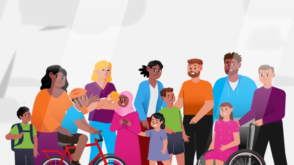
Government agencies produce enormous volumes of high-quality information. Research findings, program evaluations, policy updates, process guides, eligibility frameworks: the content exists. The problem is that most of it is written for people who already understand the system rather than for the communities it is meant to serve.
A 60-page housing policy report communicates clearly to a policy analyst. It does not communicate clearly to a first home buyer trying to understand whether they qualify for a scheme. A 20-page clinical guideline serves a health professional. It rarely serves a patient navigating a new diagnosis. The information is correct. The format is wrong.
This is where infographics earn their place in a government communications strategy. Not as decoration, and not as a dumbed-down substitute for real information, but as a format specifically designed to deliver complex content to time-poor, low-context audiences in a way that respects both the material and the reader.
The Gap Between Information and Understanding
Public sector communicators often conflate having published information with having communicated it. If the report is on the website and the media release went out, the job is done. But publication and comprehension are not the same thing. The question is not whether the information is available. It is whether the intended audience can actually use it.
Most community audiences do not have the time, the literacy level, or the background knowledge to extract useful meaning from long-form government documents. This is not a reflection of intelligence. It is a reflection of the document format itself, which prioritises completeness, legal defensibility, and internal consistency over the needs of the reader.
Infographics close this gap by doing the interpretive work. They identify the most important information, organise it around how a reader actually processes visual content, and remove the surrounding material that creates noise without adding value. The result is not less information. It is better-communicated information.
Where Infographics Work Best for Government
Not every government communication needs an infographic. Long-form documents still serve important purposes for specialist audiences, legal records, and accountability purposes. But there are specific contexts where an infographic consistently outperforms other formats for reaching community audiences.
Process and eligibility communications are the clearest example. When a government program involves multiple steps, conditional eligibility, or a sequence that must be followed in order, an infographic can show that structure clearly in a way that prose cannot. A decision tree, a step-by-step diagram, or a flowchart communicates both the content and the logic simultaneously, reducing confusion and support burden.
Data and research findings are another strong use case. Government agencies regularly produce data that has genuine public relevance but sits inaccessible in spreadsheets and technical reports. Visualising that data for a public audience, through charts, comparisons, maps, or annotated diagrams, extends the reach of the research and demonstrates transparency without requiring the reader to interpret raw numbers.
Public education on policy changes is a third area where infographics add significant value. When legislation changes, when a new scheme launches, or when eligibility criteria are updated, the gap between what has changed and what the affected community understands can create real harm. A well-designed infographic that explains the change clearly, shows who is affected, and outlines the next steps reduces that gap quickly and at scale.
The Design Discipline Is the Communication Discipline
One reason infographics are sometimes dismissed in government settings is that poorly executed infographics are genuinely bad. Cluttered layouts, inconsistent visual hierarchies, decorative elements that obscure the data, and colour choices that fail accessibility standards all produce infographics that are harder to read than the documents they were meant to replace.
Good infographic design is a communication discipline, not a graphic design discipline. The designer’s job is not to make something that looks impressive. It is to make the information as legible as possible for the specific audience. That requires understanding the audience’s context, their likely reading patterns, their access needs, and the environment where the infographic will be used.
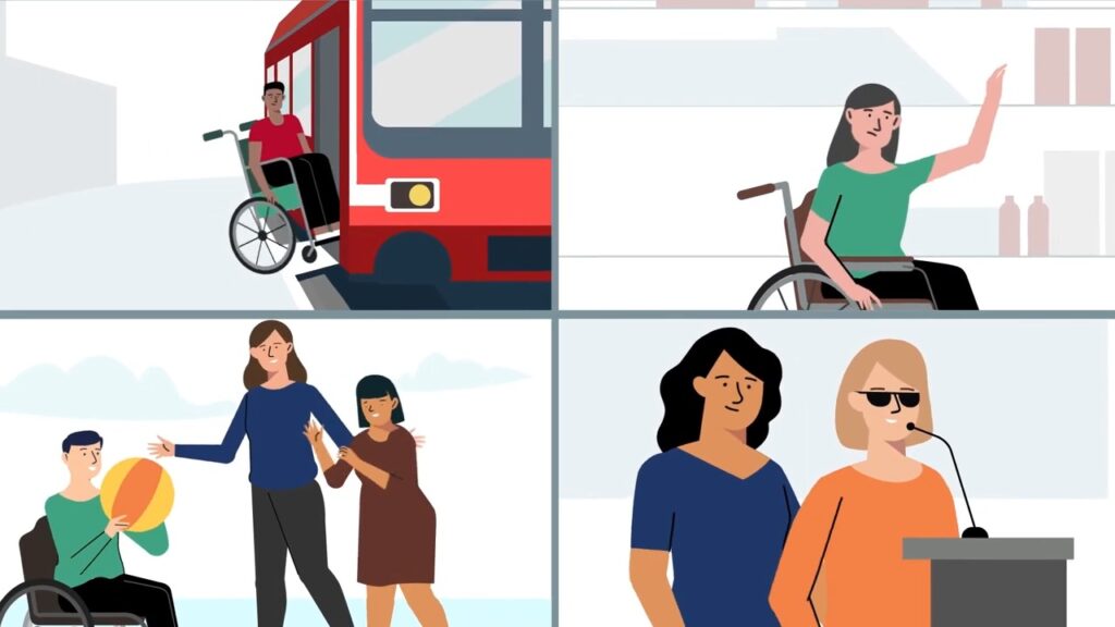
For public sector communications, accessibility is non-negotiable. Infographics designed for community audiences must consider colour contrast, text size, readability for people with low vision, and screen reader compatibility for digital formats. These are not add-ons. They are design requirements that shape every decision from layout to colour palette.
Infographics as Part of a Broader Comms Strategy
The most effective use of infographics in government communications is not as a standalone asset but as part of a broader suite. A long-form report can be accompanied by a one-page summary infographic for community audiences. A program explainer video can be supported by a process diagram for people who prefer to read. A public campaign can use infographics for social channels while longer content sits on the website for those who want more detail.
This layered approach serves different audience segments without requiring separate full-scale productions for each one. It also increases the longevity of the content because each asset can be updated independently as information changes.
Public sector teams that build infographic capability into their communications planning from the beginning, rather than treating it as an afterthought once the main document is done, find that the clarity exercise involved in creating an infographic often improves the quality of the source document as well. Identifying the most important information for a visual summary forces the kind of editorial discipline that makes all communications cleaner.
Getting Started
If your team has existing research, policy documents, program guides, or data sets that are not reaching the audiences they should, infographics are worth serious consideration. The starting point is not the design. It is the question: what does this audience actually need to understand, and in what context will they be reading this?
That question, answered honestly, usually reveals both the right content for the infographic and the right format to present it in. You can explore how our infographic design service approaches this for public sector and community contexts, or take a look at our portfolio to see examples across government, health, and education sectors.
Let Us Help You Communicate More Clearly
If you are a communications manager in the public sector and you are sitting on research or policy content that is not reaching your community audience, we would like to help. Contact the Punchy team for a conversation about what your content needs and how visual communication can close the gap between publication and understanding. You can also browse our portfolio to see the kinds of public sector communications challenges we have helped Australian organisations solve.