Why Government Audiences Stop Reading
Government communications teams produce some of the most important public information in the country. Policy explanations. Service updates. Compliance guidance. Public health messaging. Eligibility criteria for support programs. Voting instructions. Emergency advice. The stakes are high and the audiences are broad, diverse, and often time-poor.
The problem is that government information is rarely simple. It comes laden with technical language, legislative context, exceptions, conditions, and qualifying statements that make accuracy possible but readability difficult. Add the volume of communication that lands in any given citizen’s inbox, letterbox, or feed each week, and the result is predictable. People stop reading. Not because they do not care, but because the cognitive cost of working through dense text is higher than the perceived value of doing so.
This is where infographics earn their place in the government communications toolkit. Used well, an infographic can take a piece of information that a citizen would never read as a 600-word policy summary and make it both readable and memorable in 30 seconds. For comms teams trying to land important messages with limited attention, that is a meaningful shift.
What Infographics Do That Text Cannot
Infographics work because they use visual hierarchy to do what dense text cannot. They prioritise. They make it instantly clear what the most important piece of information is, what supports it, and what is detail the reader can engage with if they want to. A well-designed infographic answers the reader’s first three questions before they even know they have asked them.
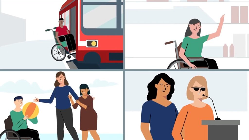
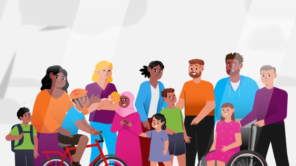
They also do something more subtle. They translate. A complex eligibility flowchart, a multi-step service pathway, or a comparison between two policy options can be rendered visually in ways that bypass the language barrier that often blocks engagement with government content. For audiences with lower English literacy, for multicultural communities, or for citizens with limited time, the visual layer carries the meaning that the text alone cannot.
For government comms teams working across diverse audiences, this is an enormous practical advantage. A single infographic can do the work of three or four written versions, because it is more accessible at the point of contact. The audience does not need to translate the message in their head. The design has already done that work.
Where Infographics Fit in a Government Comms Campaign
The strongest government communications campaigns do not rely on a single format. They use a mix of formats that work together, each playing a specific role in the audience’s journey. Infographics tend to do their best work in three of those roles.
As campaign launch assets. When a new program, service, or policy is being introduced, an infographic is often the first place an audience encounters the headline information. It compresses the announcement into something shareable, screenshot-friendly, and quotable. Journalists pick it up. Stakeholders forward it. Community groups print it.
As companion pieces to video content. Video carries emotion and narrative. Infographics carry detail. The two together cover the gap between persuasion and practical information. A video might explain why a new service exists; an infographic explains exactly how to access it. Government audiences who have watched the video often want the infographic afterwards, because it gives them the takeaway they can act on.
As ongoing reference material. Infographics live well beyond their launch moment. A clear visual explanation of a service pathway, a benefits eligibility flow, or a complaints process can sit on a government website for years and continue to do useful work, often more efficiently than the longform written version of the same information.
The Role of Fact Sheets in Government Communications
Closely related to infographics, fact sheets are another design-led format that government comms teams underuse relative to their value. Where infographics tend to be visually heavy and message-led, fact sheet design sits in a more functional space: longer, more text-driven, but still designed for scannability and accessibility.
Fact sheets work particularly well for government comms teams that need to publish information that is too detailed for an infographic but too dense in its original policy form. A well-designed fact sheet can take a six-page departmental briefing and turn it into a two-page accessible reference document that frontline staff, stakeholders, and community organisations can actually use. For multilingual rollouts, fact sheets translate cleanly across languages because the structure carries the meaning, not just the words.
The most useful government fact sheets share a few characteristics. They lead with the practical: who this is for, what it does, how to access it. They use headings the reader can scan to find what they need without reading the whole document. They include a clear call to action: a phone number, a website, a service centre, a next step. And they are designed with accessibility standards in mind, including readable typefaces, sufficient colour contrast, and consideration for screen reader compatibility.
Why Government Comms Teams Are Investing More in Visual Design
A shift is happening across federal, state, and local government communications teams. Visual design, once treated as a downstream output of campaign work, is increasingly being treated as a strategic capability. The reasons are practical.
Audience expectations have changed. Citizens encounter polished visual content all day in their personal feeds. When government communication feels visually flat by comparison, it does not just look dated, it implies that the message itself is less important. Strong visual design is now part of how government earns trust.
Accessibility requirements have tightened. Government communications must be accessible to citizens with disability, citizens with limited English, citizens with low digital literacy, and citizens in rural and remote areas. Visual design done with accessibility in mind makes those requirements achievable in ways that text-only communication cannot.
Distribution channels have multiplied. A single piece of information might need to live on a website, in a printed brochure, on a social tile, in a community newsletter, on a poster in a service centre, and in a video subtitle. Visual design built with that ecosystem in mind makes the same core information portable across all of those places. This is also where audience analysis earns its keep, because it tells comms teams which channels and formats their actual audience is using, not which ones internal stakeholders assume they are using.
Common Mistakes Government Comms Teams Make With Infographics
A few patterns weaken infographic work in government settings, often unintentionally. The first is treating the infographic as a place to fit every piece of information from the original document. The result is dense, cluttered, and reads worse than the document it was meant to replace. Good infographic design is about subtraction, not addition.
The second is designing the infographic around departmental preferences rather than audience needs. Infographics built to satisfy internal stakeholders often miss the citizens they are supposed to reach. Testing the design with the target audience before publication is a step worth taking, even informally.
The third is forgetting that infographics need to be designed for their actual distribution context. An infographic designed for a website looks different to one designed for social, which looks different to one designed for print. Producing a single version and pushing it across every channel rarely works well. The strongest government infographic work is built with channel-specific versions from the start.
To see how government and public sector teams have approached visual communication work, you can view our portfolio here. The best examples tend to share a common thread: the design exists to make the citizen’s life easier, not to satisfy the department’s internal sign-off process.
Ready to Make Your Next Campaign Easier to Read
Government comms teams are not short on information to communicate. They are short on attention from the audiences who need that information most. Infographics, fact sheets, and well-designed visual content close that gap. They take the work the department has already done, the research, the policy thinking, the stakeholder consultation, and make it usable for the citizens it was meant to serve.
If you are planning a campaign that needs to translate complex information into something audiences will actually engage with, get in touch with the team. We work with government comms teams across federal, state, and local levels, and we are happy to talk through how visual design could support your specific project.