


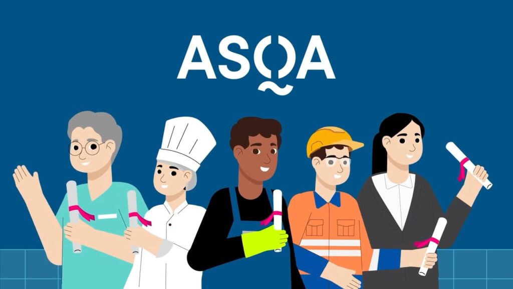
Animation
Our fully equipped animation studio creates engaging animated videos that make complex ideas easy to understand.
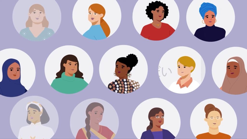
Turn statistics, research, and complex information into visuals people can actually absorb. We help organisations present data clearly and compellingly, so your findings reach the people who need to see them.
Our infographic design service combines data visualisation, clear hierarchy, and strategic communication to turn complex information into visuals people understand. Every project is built around your findings, your audience, and the story your data tells.
Our fully equipped animation studio creates engaging animated videos that make complex ideas easy to understand.
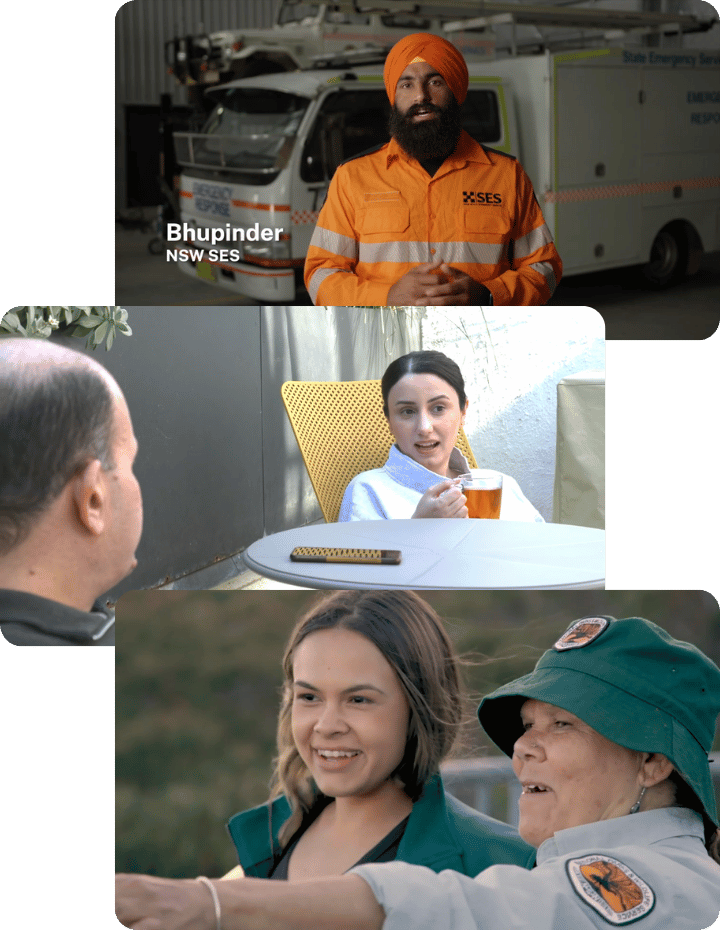
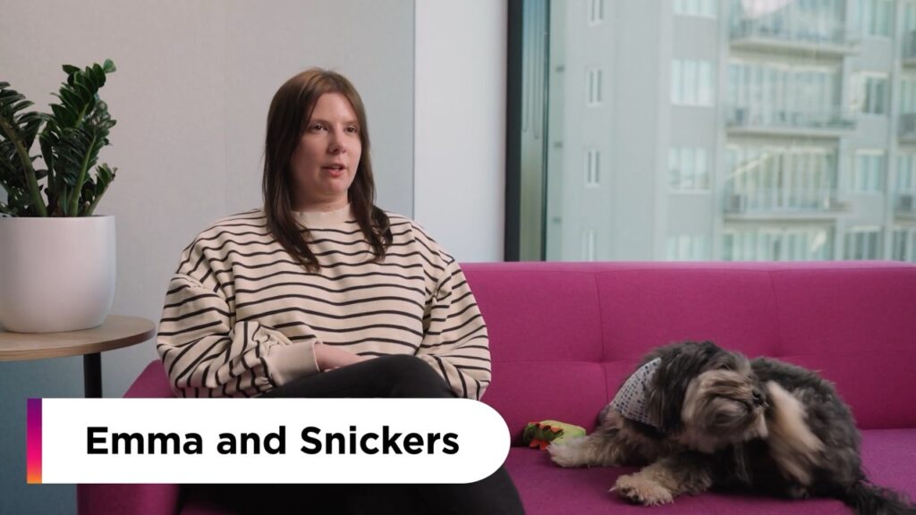
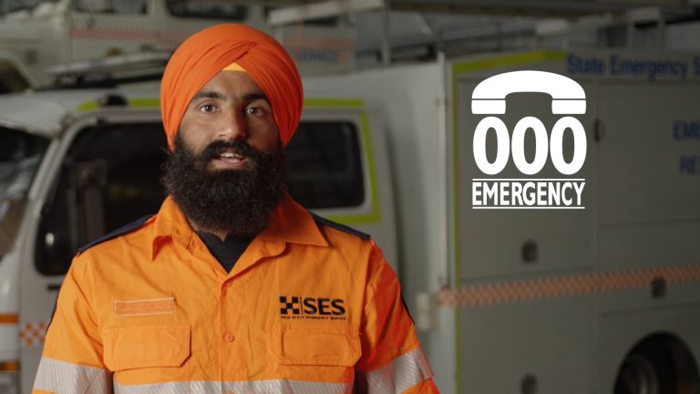
We produce live-action videos that capture real people and real stories to build trust and credibility.
We design clear, purposeful visuals that help information land quickly across print, digital, and campaign channels.

We provide strategic guidance to ensure video and design are used intentionally, not as one-off deliverables.
Every project we deliver is backed by strategy, collaboration, and purpose. For more than 14 years, we’ve helped organisations across Australia connect with their communities, inspire action, and build trust through clear, creative communication.
Our team makes complex campaigns simple, guiding you through every step with structure, clarity, and support.
Your research is solid, your findings are important, and nobody’s reading the full report.
We understand the challenge of making statistics and complex information accessible without losing the substance.
That’s where infographics help and where Punchy makes the process effortless.


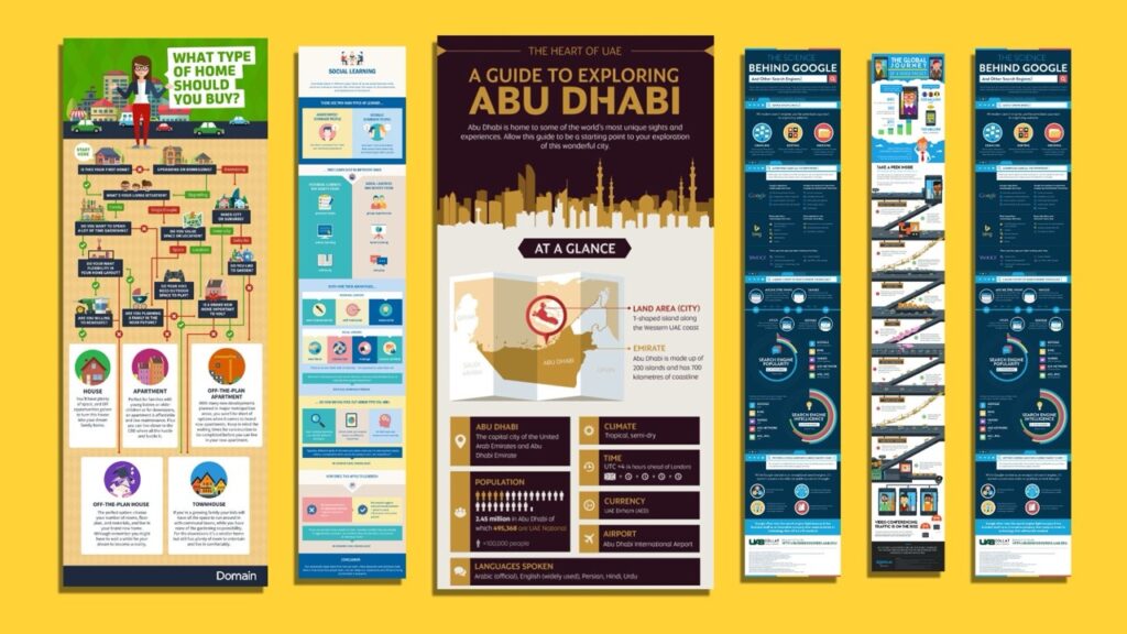
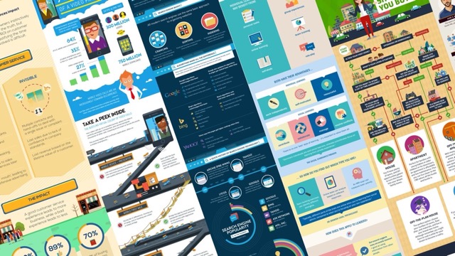
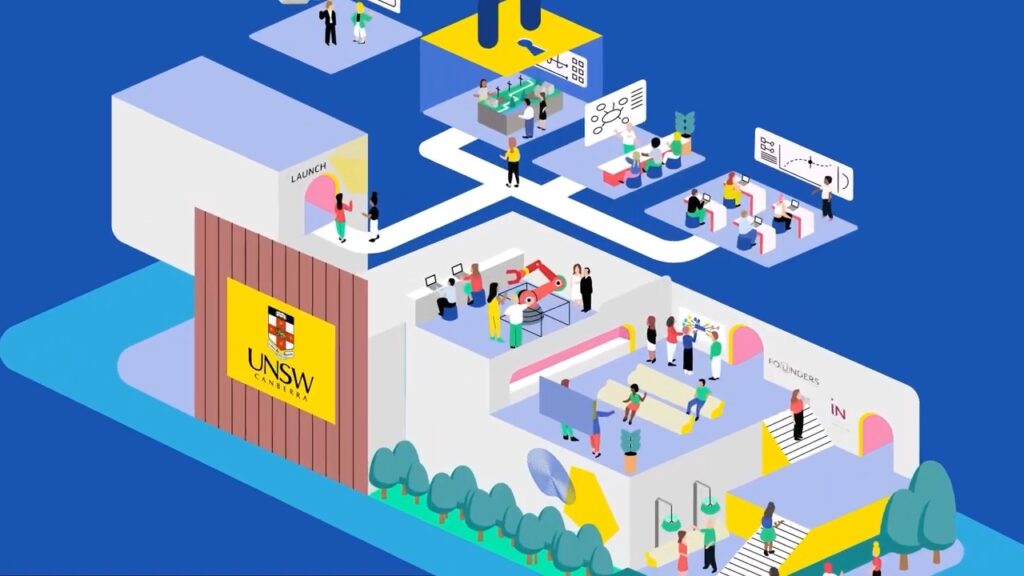
An infographic is a visual way of explaining information so people can understand it quickly without reading large amounts of text. It is the right format when you need to simplify a topic, highlight key points, or show relationships between ideas. Infographics are often used when the audience is busy, when the information is dense, or when clarity matters more than persuasion. They work well for public education, internal communication, and reporting, because they remove unnecessary complexity and show only what the viewer needs to know.
We design information infographics, process diagrams, timelines, decision trees, data visuals, maps, scenario flows, and one page communication tools. We can also create multi page infographic packs for education or compliance. Our focus is on clarity and understanding rather than decoration, so every visual choice has a purpose.
Use an infographic when the audience needs to refer back to the information, when they may not have audio available, or when the information needs to be read at a glance. Infographics are also useful when the message is static and does not require narrative or step by step pacing. Video is better for storytelling, emotion, or guided learning. Long form text works for detail and nuance. Infographics sit in the middle by making complex material accessible without requiring time or attention that some audiences do not have.
Yes. Infographics are often most valuable when the content is complex or technical. We break information into small pieces, show relationships visually, use plain language, and remove unnecessary detail. This helps the audience understand what matters without reading technical documents. We work with stakeholders to ensure accuracy and respect for context.
Yes. Infographics are useful for behaviour change because they remove confusion. When people see what to do, why it matters, and how it works in a simple sequence, the barrier to action is lower. They are widely used in health, safety, environment, and community campaigns. We design for clarity rather than pressure, which supports informed decision making rather than persuasion.
We separate the information into core and supporting layers. Core information is what the audience must understand to act or make sense of the topic. Supporting information may sit in tooltips, websites, or documents. We remove jargon or explain it in plain English. We involve stakeholders early to confirm accuracy. The goal is not to dumb anything down, but to remove friction so the important parts land.
Yes. We design for readability, colour contrast, clear hierarchy, and plain language. We avoid relying solely on colour to communicate meaning. We can also provide alternate text descriptions and text only versions if required. For culturally diverse audiences, we adjust tone, icons, and visual cues so the material feels respectful and clear.
Pricing depends on complexity, data requirements, and the number of versions needed. Process diagrams or single topic infographics sit at the simpler end. Multi page packs or detailed data visuals sit at the more complex end. Once we understand the audience, purpose, and requirements, we provide a fixed quote so you can plan with certainty.
Yes. We offer fixed pricing once the scope is defined. If scope changes, such as adding more modules or versions, we flag it early and quote it before continuing. We do not hide costs behind vague line items.
Packages include design, illustration, text layout, and delivery of final files. We can also include accessibility versions, translations, templates, and social or print variants if needed. We confirm inclusions upfront so expectations are aligned.
Most infographics take one to three weeks depending on complexity and the number of stakeholders involved. Larger packs can take longer. If your team responds quickly, we can move quickly. We avoid rushing at the expense of accuracy or clarity.
Your involvement depends on how clear your content already is. If the content is structured, we handle the design. If it is not, we may ask clarifying questions or suggest a structure. We handle design decisions so you do not need to manage details.
We involve stakeholders early so accuracy is confirmed before final files are produced. Stakeholders review content, data, language, and context. We check that visuals reflect the intended meaning and do not distort the information. This reduces risk for organisations that must communicate responsibly.
If content changes during design, we update the layout and visuals accordingly. If changes are significant or repeated, we will flag any timing or cost impacts before continuing. For organisations that expect ongoing updates, we can create editable templates to reduce cost in the future.
Yes. Infographics can be adapted for print, social, web, presentations, or training. We can also create modular assets so your team can reuse diagrams or components in future communication. This increases value and reduces duplication of work.
You do. We provide final files and source files at delivery so your team can update or adapt content later. We do not lock source files behind ongoing fees.
A short conversation is usually enough. We can help you clarify the purpose, audience, and core message. We can also give rough pricing and timelines so you can plan internally. You do not need a finished brief. We can help shape it once we understand your context.
One of our expert strategists will call within the hour to discuss your project, provide transparent pricing and realistic timelines so you know exactly what to expect.
Alternatively, you can book a meeting at a time that suits you here.
Submit the form to receive our full pricing guide with transparent costs, inclusions and timelines.


