


Infographic Design
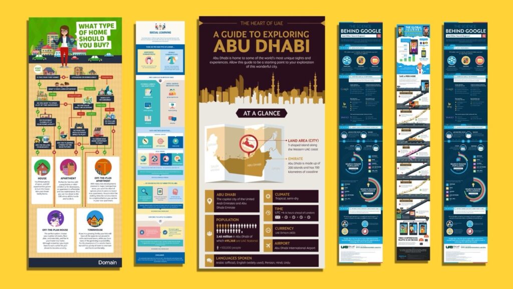
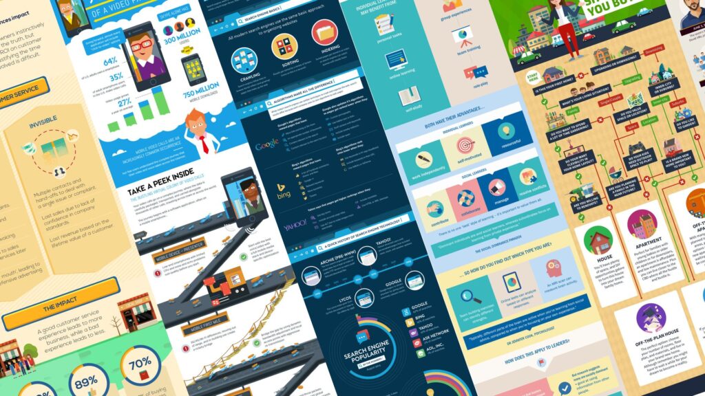
We design infographics that turn complex data and statistics into visual stories people can grasp at a glance.
We help government, education, and purpose-driven organisations communicate complex information with confidence, from infographics and fact sheets to social graphics and presentations that make every message easy to understand and remember.
Our design service combines creativity, strategy, and accessibility to help your organisation communicate with confidence. Every project is tailored to your goals, your audience, and your visual identity.
We design infographics that turn complex data and statistics into visual stories people can grasp at a glance.
We design presentations that keep audiences engaged and help your message land with impact.

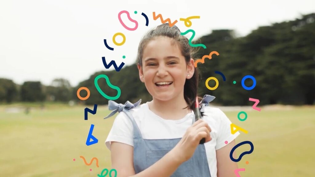
We create thumb-stopping social media graphics that cut through the noise and spark engagement.
We design fact sheets that organise dense information into clean, scannable formats people actually read.
Every project we deliver is backed by strategy, collaboration, and purpose. For more than 14 years, we’ve helped organisations across Australia connect with their communities, inspire action, and build trust through clear, creative communication.
Our team makes complex campaigns simple, guiding you through every step with structure, clarity, and support.
Audiences remember what they can see and understand.
Yet for many public organisations, creating consistent, accessible design across channels can feel challenging, from managing approvals to maintaining brand alignment.
We make the process simple, structured, and focused on communicating your message clearly every time.


Our core design services include infographics, presentation design, social media graphics, and fact sheets. We focus on communication design rather than decorative design, which means our work is built to inform, clarify, and support real decision making. We can also create visual systems, icon sets, diagrams, data visuals, and supporting campaign assets when needed. If your content involves public education, internal training, or community engagement, our design approach is built for that context.
Most graphic design focuses on aesthetics. Our work focuses on communication outcomes. We simplify information, remove noise, and help the viewer reach understanding quickly without needing long explanations. This is especially important for health, education, government, and technical content. We also consider behaviour, reading patterns, accessibility, and audience context so the design does more than look good. It has a job and it performs that job well.
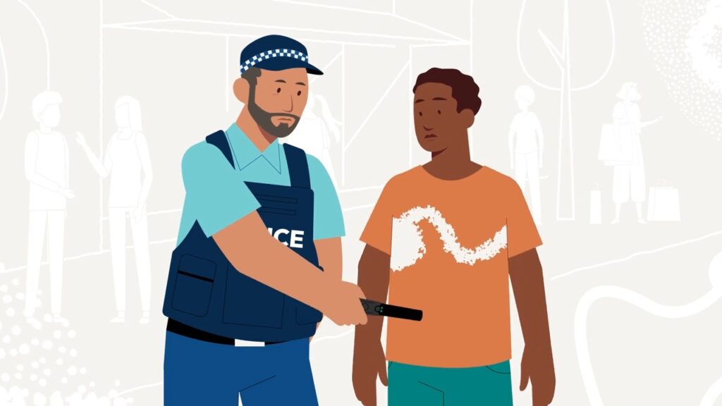
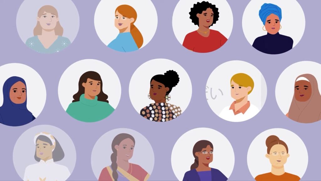
Illustration helps when photography feels too literal, too personal, or not inclusive enough. It is also useful for technical subjects, future scenarios, or environments that are hard to photograph. Some organisations avoid stock imagery because it feels generic or inaccurate. Illustration provides control over tone, representation, and detail without relying on staged or commercial looking photos. If privacy, cultural context, or sensitivity is a factor, illustration can also reduce discomfort.
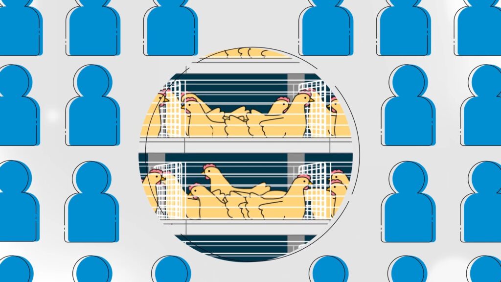
Yes. This is where design earns its value. We can turn dense content into diagrams, layered visuals, timelines, decision trees, or simplified workflows. This helps audiences understand what matters without reading long documents. We work with content owners to separate core information from supporting detail so accuracy is maintained without overwhelming the viewer.
Yes. Our design work often sits across public education, internal staff training, safety and compliance, community engagement, and multi channel campaigns. We consider where the asset will live, how audiences will encounter it, and how much time they will spend with it. This ensures the asset is fit for purpose rather than treated as a single static graphic.
Yes. We can adopt your typography, colours, layouts, tone, and logo usage so the asset feels native to your brand. If your brand guidelines are broad, we can provide structure and consistency. If your brand is strict, we can work within those boundaries without compromising clarity or accessibility.
Yes. If your brand does not have strong rules for diagrams, data visuals, or information design, we can create a visual system that gives your team guidance on how to present information consistently. This can include colour hierarchy, iconography, illustration style, and layout patterns. It does not replace a brand refresh. It provides clarity in areas where your brand currently lacks structure.
We remove unnecessary decoration, use plain language, prioritise contrast and readability, and structure content so the viewer knows where to look first. We also avoid jargon where possible or explain it clearly. If the audience includes low literacy groups or culturally diverse communities, we adjust tone, visual cues, and pacing. The aim is to respect the viewer by making information easy to absorb.
We can. Through our audience analysis and concept testing services, we run workshops or feedback sessions to understand how real people interpret the content. This is useful when designing for diverse communities, technical subjects, or behaviour change campaigns. Testing reduces risk and prevents stakeholders from guessing what audiences will understand.
Pricing includes design, illustration, and delivery of final files. Strategy, accessibility versions, translations, and template creation can be added if required. We clarify inclusions upfront so expectations are aligned. We do not hide costs behind vague line items.
Yes. Once we understand the scope, we provide fixed pricing so procurement and finance have certainty. If the scope changes, such as adding more assets or rounds, we flag it early and quote it before continuing.
We include revisions because communication work benefits from refinement. For larger or more strategic design programs, we often use collaborative rounds rather than strict caps. Our aim is to reach clarity, not rush sign off.
Simple assets like social graphics or fact sheets can take one to two weeks. Larger assets like infographics or presentation systems may take two to four weeks depending on complexity and stakeholder reviews. If your team is responsive, we can move quickly.
Your involvement depends on how much clarity you already have. If you have messaging defined, we handle visual execution. If messaging is unclear, we may ask questions or suggest structure. For strategic work, we involve stakeholders early so decisions are made before design begins rather than at the end.
You do. We provide final files and source files at delivery so your team can update or adapt the assets in the future. We do not lock files behind ongoing fees.
Yes. We can produce assets for other channels, and we can provide templates or systems so your team can adapt material themselves. This increases value and avoids recreating work from scratch.
A short conversation is usually enough. We can help you define the problem, audience, and expected outcome, and we can give rough timelines and pricing. You do not need a full brief or finished messaging. We can help shape that once we understand your context.
One of our expert strategists will call within the hour to discuss your project, provide transparent pricing and realistic timelines so you know exactly what to expect.
Alternatively, you can book a meeting at a time that suits you here.
Submit the form to receive our full pricing guide with transparent costs, inclusions and timelines.


